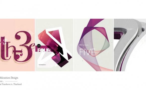
 A professional portfolio is a necessity for anyone working as a freelancer in the creative industry. Not only does it allow you to showcase your design expertise to prospective clients, it also gives you the opportunity to establish a unique brand for yourself as a designer. And while physical portfolios continue to be a staple in the design world, online web design portfolios offer you an entirely new avenue to reach audiences outside of your immediate professional circle.
Unlike a physical portfolio, an online web design portfolio allows to show off your work in a medium that actually showcases the work you really do: web design. Prospective clients get to see your amazing work, and they're also able to interact with the portfolio itself — another testament to your design expertise. Considering that your prospects will want to assess the quality of your work before hiring you, your online portfolio is a great way to demonstrate your abilities as a web designer.
Of course, creating a portfolio website is no walk in the park. We’re often our own worst critics and this goes double for anyone working in design. So whether you are creating your first web design portfolio, or re-working an existing one, expect to invest significant effort into building something truly compelling.
To streamline your portfolio planning process, here are a few insights into what makes or breaks a great web design portfolio.
 1. Include your best web design work only
This should be a no-brainer. Since your web design portfolio will play a major role in winning the confidence of potential clients, it’s worth taking the extra time to go through all your design work to separate the average from the impeccable. Even if you aren’t usually the boasting type, this is one place where it’s okay to be a little self-aggrandizing.
When you’re going through your old web design projects, try to select examples that showcase the diversity of your capabilities and experience. Featuring projects from a variety of industries, design styles, mediums, and site types will let clients know that you’re more than a one trick pony. In addition, it’s a good idea to limit your examples to your most recent projects. That way, your portfolio will accurately reflect your current level skill and expertise with design.
If you’re just starting out and don’t have a ton of client work to showcase, don’t worry. It’s perfectly fine to include personal design projects, mockups, and design school assignments in your portfolio. Plus, including “passion projects” like these can allow you to more accurately express your unique creative style and vision.
 2. Keep a professional and cohesive experience
You should treat your web design portfolio just like you would any other design project. Once it goes live, it will act as your resume and will live on to become a direct extension of your personal brand. That means it’s worth your time to ensure the final product conveys a consistent visual narrative that wins over the hearts of clients — and opens their wallets, too.
Of course, striking a balance between cohesion and creativity can be tough to achieve. By no means am I advocating for a traditional portfolio with a boring layout, but there are some basic rules of UI you should try to follow to make things easier for your user. For example, each project page should have consistent layouts, writing styles, and image sizes. And every page of your web design portfolio should share similarities in terms of colour, layout, and experience.
Another important place to check for consistency is your usage of text. Typography will help you set the tone on your portfolio site, especially in your case studies (see tip #3). But you’re going to want to make sure that it never steals attention away from your design samples. To guarantee that your work remains the focal point for the user, try limiting your typography to one type family.
YOU MIGHT ALSO LIKE
![Division [1] Web Design & Development](/img/video/division_1_web_design_development_37.jpg)
