 The folks at Lyons came to me because it was time for some “new clothes;” something that really showed off their curves—quality work, passion, and integrity. I had discussions with both Debra and her son Matthew, the sales and business manager, to find out about their goals and visions. Not only did they want to show of their products but they wanted to give their users the ability to get samples right from the site; to actually touch and feel the paper without having to go through an agent.
My goal was to make sure the user would get a sense of all the texture that is used throughout Lyons’ collections as well as put emphasis on the fact that is handmade.
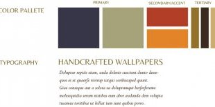
We started with updating the logo a slightly, as they liked what they had before but wanted to bring a bit more exclusivity to it as well as personality. I brought texture to it to match their work and used a more elegant font for the name, in order to attract their perfect client. The color scheme was based on the body of their work to match and enhance their products.
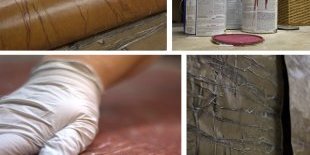
I was also able to achieve my vision of showing off the textures, personality and exclusivity by conducting a photo shoot in their studio and getting up close during the process of making the papers.
Pro tip: if you are a business owner, put some extra effort into having your photos done professionally and you will be forever thankful.
As far as the website goes, the first step was all about organizing the material, then finding a few elements we wanted to enhance and put in focus. Then we finished it off by adding the brand styles we created during the logo process. One nice touch was that we included some of Debra’s quotes and messages to give a taste of what her clients will receive when they collect their orders.


YOU MIGHT ALSO LIKE


