

Steps
- Improve the loading speed of web pages. Web pages should take no more than 15 seconds to load. The quicker your web pages load, the sooner your visitors can become engaged with your website. If your web pages take more than 15 seconds to load, your visitors may lose interest in your website and leave.
- Use only the best images. Minimize the number of images you use, and use images that contain simple designs and minimal colors. If your web pages contain multiple animations or Adobe Flash effects, the pages will take a longer time to load.
- Use a free online tool or website that checks your page-loading time. This will help you verify that your web pages load within 15 seconds. You can find a variety of tools on the Internet by using keywords in the search engine such as "web page loading tool" or "check load speed of website."
- Check that the web pages that work and display correctly in every browser. Most browsers will recognize web pages that contain simple (Hypertext Markup Language) HTML and (Cascading Style Sheets) CSS coding. Some coding may not be recognizable to some browsers, which may cause your content to display inaccurately or appear unattractive.
- View your web pages in every Internet browser.
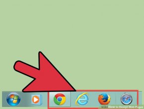 This will help you verify that they display correctly; such as Internet Explorer, Firefox, Google Chrome, Safari, and more.
 - Use free web tools that analyze your web pages and checks their compatibility with all browsers. These web tools can be found be entering keywords into a search engine such as "browser compatibility test."
- View your web pages in every Internet browser.
- Ensure that the web pages are easy to navigate. This factor will help guide your visitors to the proper web page or goal; especially if your website sells products or services.
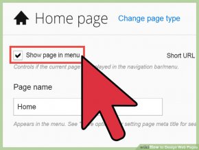
- Place your navigation links in spots that are easy for visitors to find; such as at the top of your web pages, in your sidebars, or at the bottom of your web pages.
- Design your navigation links so that they are easy to understand and organized according to importance. For example, if your web pages feature products that your visitors can purchase, place the "checkout" link at the top of your web page so the link is displayed clearly to your visitors.
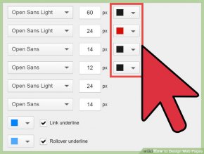
- Use colors on your web pages that make your text easy to read. This will help encourage your visitors to spend time on your website; whereas if the colors of your background and text is too difficult to read, your visitors will most likely leave your website.
- Use color combinations that are easy to read and view, such as black or blue text on a white background, as opposed to using bright or neon colors in your background or text.
- Use a common font type on your web pages that is easy to read. This will help keep your readers engaged in your content and will maintain browser compatibility, as some browsers may not support fonts that are less common.
- Use common font types such as Arial, Courier New, Georgia, Times New Roman, and Verdana as opposed to fonts such as Comic Sans, Papyrus, and fonts displayed in cursive.
- Place the most important information at the top of your web pages. If your visitors are engaged or interested in the information they see when they first land on your web page, they will most likely scroll down to see additional content and continue to navigate through each web page.
- Display the tagline for your business or website at the top of the web page, as well as prominent links for purchasing products or services.
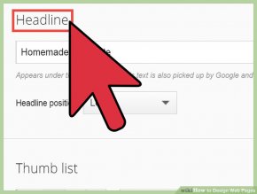
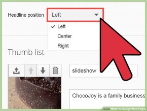
- Carefully word the web page title and headings of every web page. An accurate headline that describes the topic or content of the web page will help intrigue and interest your visitors. For example, if your website contains a page with sale or clearance items, use a bold headline such as "Clearance Items."
- Break up text into short paragraphs or sub-categories. Text that is separated into short paragraphs or made into bullets is more aesthetically pleasing to your visitors; as opposed to long paragraphs in a block-style format.
- Publish text that makes up paragraphs that are comprised of no more than 3 or 4 sentences.
YOU MIGHT ALSO LIKE

Responsive web design tutorial

How to Design a Web Page
Full web page design step by step Bangla tutorial #2


