Web design is a faced-paced industry, and we often see big trends come and go. But many of the Web design trends we’ve seen rising in the last few years are still around, and more new trends are emerging.
Here are 10 trends that will likely dominate the best websites:
1. Sites will use full-screen video backgrounds.
Full screen and ambient background video is an increasingly popular trend and has been capturing designers’ attention all over the Web. Full-screen (or almost full-screen) videos with minimal content overlaid on top provides a rich user experience. Videos give visitors an instant impression of your brand, captivating them and drawing them deeper into your website. In addition, changing the video each season keeps your site feeling fresh.
2. Flat design will continue to dominate.
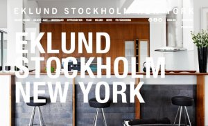
The flat, minimalist design trend will only gain more momentum in 2015. Flat design focuses on typography, presenting content in a simple and compelling way. Flat design is clean and modern, and it showcases only the most essential elements of the site. Without extensive depth, color schemes for flat design are relatively simplistic — sometimes vibrant — and the font styles are crisp. Flat icons are growing in popularity and seem to be here to stay for a while, as they’ve even been adopted by large companies like Microsoft and Apple (and their respective mobile devices). Flat design is minimalist, clutter-free and content-focused.
3. Scrolling, not clicking, through pages.
Various scroll site iterations are increasing in popularity and have now overtaken clicking through page after page of content. Single-page scrolling sites are more intuitive than multiple-page clicking sites. Users want to scroll! Scrolling also allows for more dynamic interactions. Scrolling is faster than clicking and is a noncommittal action. This trend becomes more interesting when storytelling is included in the mix, as it allows for increased creativity. With more experiments being done with parallax designing, you can expect to see a lot more long-scrolling pages in 2015.
4. Typography will take center stage.
Typography is often overlooked in Web design. The font you choose for your site determines the readability and the relevance of the content as a whole. Bold typography and large images can turn your site into a work of art. Responsive typography will also be a front-line strategy that will allow users to read text with excellent clarity on any device. Well-spaced and strategically positioned typography creates a higher contrast ratio that is easy for visitors to read and process. Your typography can create the mood of your website and add to or detract from your site’s credibility.

5. Sites will feature simple search bar s.
Simple is always better when it comes to website design. Allowing a client to begin searching for homes immediately upon arriving at your website decreases confusion and increases the time they spend on your site.
6. Mobile will continue to gain momentum.
Responsive design was a trend in 2014 that will continue into 2015, but many real estate portals and brokers are opting to create unique experiences for mobile users. Desktop and mobile usage is arguably very different. In 2014, more people used mobile devices to access the Internet than ever before. It’s imperative to create a mobile-friendly website design that looks beyond responsive design and creates an overall better mobile user experience.
7. Videos and images will replace text.
People prefer watching to reading. They have short attention spans. First impressions are important, and videos and images have a quick, effective way to make a first impression that text often can’t. Integrating images and videos on your website and reducing the text is an easy way to grab attention and tell your story quickly and more efficiently. In addition, videos make a lasting impression and help explain complicated topics that can take more time and work with text.
8. Images will get bigger and better.
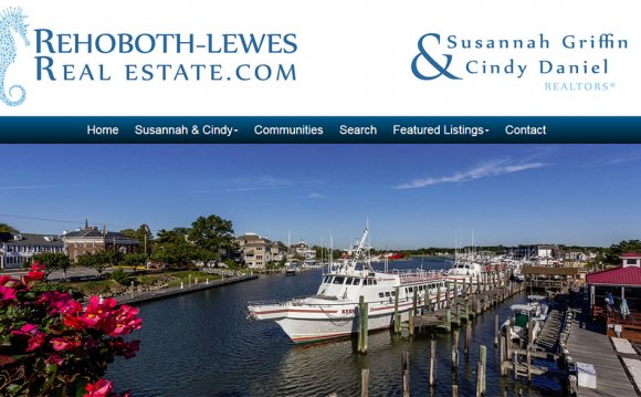
It’s not only typography that’s getting larger on the Web. Images are, too. Limited bandwidth used to impose limitations on images, but this is less of a problem now as the improvement of Internet connections has allowed for more data transfer per second, enabling images to load more quickly. Beautiful, vibrant, big images get noticed. As a result, large images have taken the Internet by storm.
9. Menus will be hidden.
It’s becoming more popular for websites to hide navigation off-screen until you interact with an element toward the top of the screen. Hidden menus enable you to keep a clean design focused on the most important elements of your site until users choose to interact with the navigation.
10. Sites will incorporate ghost buttons.
Ghost buttons are a minimal and attractive way of styling buttons that usually have some special-effect hover animation. They attract the user’s attention. They have become a favorite among designers and have a minimalist feel suitable for the flat, modern website design that’s become so popular. Ghost buttons have an elegant, finished look and add an unbeatable attraction to the “call-to-action” areas of your site.
YOU MIGHT ALSO LIKE


