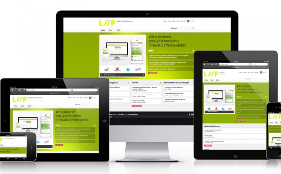
- Are your library customers complaining they can’t read your website on their phones?
- Wondering how to make your website easily readable on smartphones, tablets, as well as the desktop?
Responsive web design, the ability to craft a web site that adapts into the resolution of the device it is being displayed on, is changing the game for web developers. In this webinar, we’ll look at how responsive design principles can be applied to your web development and enable you to build a single web site that adapts to work on the desktop, tablet, and smartphone environments.
During this webinar, presenter Jason Clark will:
- Define responsive web design and the major underpinnings of this web development method, notably CSS media queries.
- Show you toolsets and resources that will help you get started with responsive web design.
- Work through performance bottlenecks and solutions for optimizing your web site to accommodate this new method.
- Walkthrough a specific responsive design example and give you the CSS and HTML code to practice on your own.
At the end of this one-hour webinar, attendees will:
- Be able to identify and apply the key components of the responsive web design (RWD) method.
- Build a working RWD prototype using supplied “proof of concept code” from
- Identify the benefits of the RWD method along with the ways to keep RWD web sites lean and loading quickly.
This webinar will be of interest to all librarians interested in web development trends and techniques.
Webinars are free of charge, you can pre-register by clicking on the Join Webinar button now or go directly to the webinar by clicking on Join Webinar within 30 of the start of the event. If you pre-registered you will receive an email with login link and a reminder email the day before the event. If you did not preregister and you can register in the 30 minutes prior to the event and directly enter.
YOU MIGHT ALSO LIKE


