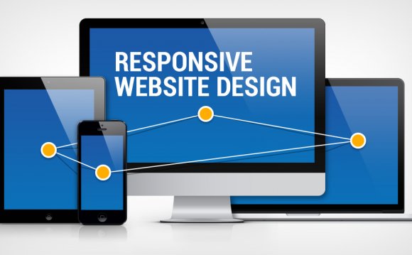
 Responsive Web Design becomes a huge trend in the design industry, and no without a reason.
According to Google Mobile Research, “Our Mobile Planet”, only about 15% of the Internet users are completely satisfied with the user experience of the mobile web, while the share of the mobile in the Internet traffic grew at the astonishing rate of 163% since 2010. We all live at the verge of the mobile era and it’s hard not to be excited. All the new devices and possibilities… it’s just overwhelming.
However with all this excitement comes the great responsibility. We need to get the web ready for people with their smartphones, tablets, ebook readers, iWatches and smartfridges. They are already at the door troubled by the experience we’re serving and they demand your website to be responsive.
You wonder how to do that? I’m not surprised. Till now this revolution lacked efficient weapons. We’ve decided to change that.
Ladies and Gentlemen, without further introductions… the Responsive Web Design Prototyping Solution:
And yeah…you know us. We’re UX design nerds. We just couldn’t resist to make it. We know many of you are troubled by prototyping responsive websites and we were troubled by that in the past. We sincerely hope that our solution (you won’t get it with any other wireframing/prototyping tool) will make yours and ours lives easier.
And now something for the eyes and your Parietal Lobe (that’s the part of your brain that responsible for representing numbers) – the info-graphic!
Ps. Do you want to spread this revolution? If you have a blog, or website here are the press materials. Feel free to use them!
YOU MIGHT ALSO LIKE


