 Inkscape is a great program to have in your toolbox as a web designer. It’s similar to Adobe Illustrator, but the user interface and tools are slightly different. It’s also an open source program released under the GPL, and is available for Windows, OS X, and Linux. This program can be used on on its own without the use of photo editing software like Photoshop or Gimp to create professional websites. This tutorial will walk you through some basic techniques for creating websites with Inkscape using this very basic blog design as a guide.
Document Set Up
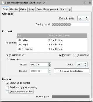
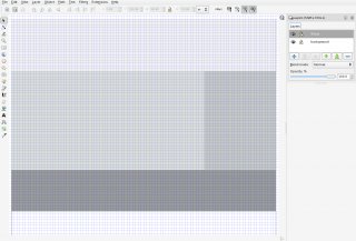
Open up a new document in Inkscape and edit the document size by navigating to File » Document Properties or just press Ctrl + Shift + D. Then choose the dimension for your website, I’ll choose 960 pixels wide by 2000 pixels high, but you can choose whatever size you’d like.
A width of 960 pixels is popular for web design because most people in the US have a computer with a resolution of 1280 by 800 or greater. However, the dimensions you choose totally depend on your target audience (which may not be the US). You may also want to consider making a special style sheet for the growing number of people accessing the web from their mobile phones.
 The Layout
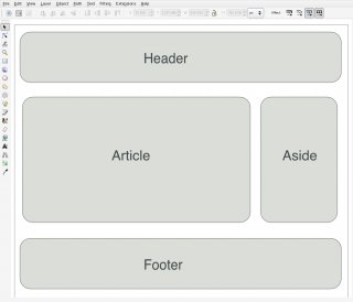
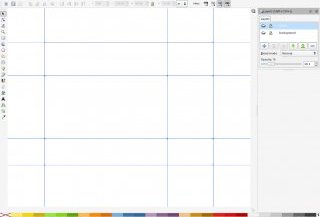
The next thing we need to think about is the site’s layout. I’m going with a fairly standard blog layout with a header section, an article section, a sidebar (which I’ll call “aside”) and a footer section. You’ll also notice that I didn’t include a navigation section. That’s because this site is a fairly simple blog and I just wanted to integrate the navigation into the sidebar.
Creating An Export Layer
Since Inkscape doesn’t support a function like Photoshop’s ability to slice an image into multiple pieces, we will need to create an export layer. To do this press CTRL + SHIFT + N, and name your new layer “slices” or “export”. Then bring up the layers pallet if it’s not already by pressing CTRL + SHIFT + L. Click on your new layer and then using the rectangle tool create the sections of your website. You’ll want to make sure that your rectangles have no stroke applied and that they’re butted up to one another as well as your document’s border. To make this easier turn on your grid ( SHIFT +3 ) and make sure snap is enabled in your document preferences. You can actually do this after you design the site and you’re ready to export, but why not just get it out of the way? You can also save this as a template to start all of your website designs with.
 Guides
Next you’ll want to select and copy all of the objects on this layer by pressing CTRL + A and then CTRL + C. Then turn these objects into guides by pressing SHIFT + G and then paste your export layer back in place by pressing CTRL + ALT + V. I like to use guides when designing, but it’s not a requirement by any means. You can turn guides on or off by pressing the pipe key “|”.
Design
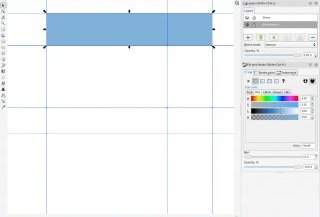
I’m going to start with the header and I already have an idea for the colors. Using the rectangle tool draw a rectangle that fills your header.
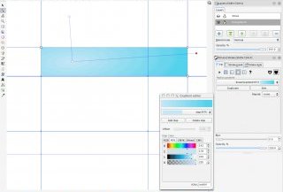
Then with your header rectangle selected open up the fill and stroke dialog box by pressing CTRL + SHIFT + F and select the radial gradient icon. Click edit and adjust your stops accordingly. I’ve chosen to use a light blue center that gently darkens at the edges.
Duplicate your header background image by selecting it and pressing CTRL + D. Then make the width of this duplicate object 40 pixels smaller. You can do this quickly by turning on the grid using the # key and using the select tool. You may also want to create new guides to use later on, but it’s not necessary for this design.
The Drop Shadow
This next step will be to create the drop shadow, which you can do easily in version .47 of Inkscape using filters, but in .46 it’s a bit more involved so this quick and easy method will do. You’re going to duplicate the header yet again (yes again) and give it a fill of black and a blur of 3.0. Then move this document below the header you created prior to this one by pressing
YOU MIGHT ALSO LIKE


