Step 3: Avoid Excessive Text
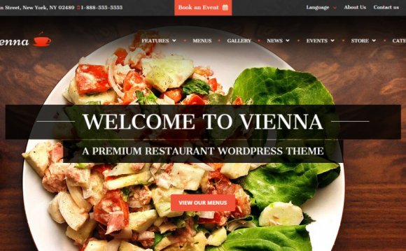
People don’t want to read anything over 140 characters these days. I see a lot of restaurants with pages dedicated to the owner, chef, history, etc. This sort of filler space is OK if you don’t have imagery to convey the information. But statistically, we don’t see a lot of time spent on text heavy pages so we know people aren’t reading it. Brief paragraphs that get to the point are appreciated by your viewers. Focus on good pictures and save yourself the effort of writing a thousand words. Notice how the homepage screen show below conveys tapas bar using an image more than text.
Step 4: Avoid music, flash animation, excessive styling, etc.
Every time I open a website with music I spend the first 30 seconds of my attention span hunting down the mute button. At that point, I’m more annoyed than hungry. Adding music is a big no no in web design. Same thing goes for animation. Flash animation used to be hip back in 2000. Apple put an end to it when they refused to show it on Ipads. In general, I’d recommend avoiding excessive styling of fonts, menus, navigation, page layouts, etc. It usually leads to poor usability.
YOU MIGHT ALSO LIKE


