 '14
'14
Archived under,
This article has been contributed by Lori Wagoner.
The designing stage is arguably one of the most important stages of a web project. It typically involves giving shape to all the information defined in the planning stage. The main deliverables upon completion of the design phase are documented site structure and visual representation of the website.
A web designer should not only be technically proficient in web design platforms and associated technology, but also a creative individual who can think out of the box.
Typically designers follow a step by step creative process. Let’s have a look at the 5 pointers that take you through this process:
1. Sketching / Brainstorming Ideas
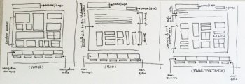
Once you are done with requirement gathering and analysis and are very sure you know everything there is to know about the project, it’s time to get into your creative zone. Get a pencil and paper and sketch out your creative ideas!

Whether you are a website design agency or a freelancer, being able to communicate ideas to clients with a sketch is really vital, especially during the early stages of a project. The best practice is to sketch out a bunch of rough designs for your ideas, narrow them down to a few and let the client provide feedback on whether you are on the right track or not.
2. Define Content & Create A Workflow
When your client green signals an idea or two, the next step of the creative process is to create a workflow. Creating a workflow includes creating a list of each section to be included on the site, with brief information on what type of content will be shown on each page.
The client is presented with the outline or the workflow so they can add, remove or adjust any sections or features. Sharing the workflow with the client gives the designer room for creativity and in turn helps in churning out innovative design ideas and keeps the client in loop at all times.
The client needs to approve the workflow before the project continues. This will help you develop a budget and time frame to build the site (not a part of the creative process but important all the same).
 3. Low-fidelity Wireframe
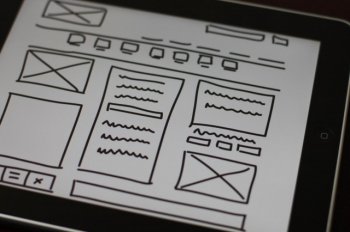
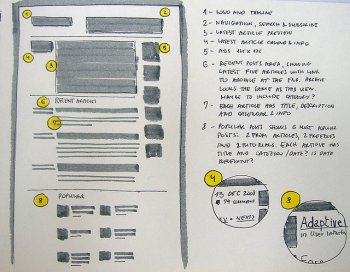
Low-fidelity wireframes provide a framework for your creative designs. These wireframes are simple line drawings of website layouts that focus on placement of elements rather than color and type. They describe in detail what features will be on the site, such as user accounts, social networking functions or a newsletter sign-up. Low-fidelity wireframes are presented as a rough sketch to the client without graphics.
A designer should not be afraid of experimentation while developing wireframes. Sometimes, as you fill in more detail, you may realize the original layout is not working well. That’s the whole point of the wireframing process; to make as many blueprints as possible in order to narrow down the best way of representing the information at your disposal.
4. High-fidelity Wireframe
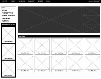
Post low-fidelity wireframes, high-fidelity wireframes play a crucial role in providing a more realistic experience of the actual product, in this case your website. These wireframes provide a better outline of the product; filling in the details missing in low-fidelity wireframes. These wireframes define the visual hierarchy of the page, actual form and interaction elements, and often labels, instructional text and some copy.
They are extremely helpful as they determine what content deserves the most focus and the percentage of space they can occupy on a page. They can be used in sequence to show how a specific task can be accomplished in a sequence of screens. These wireframes highlight how user friendly and intuitive the product is going to be.
High fidelity wireframes incorporate a level of detail that closely matches the design of the actual webpage though it should not dictate the final design or UX. So before finalizing, you should tryout different versions by experimenting with the 3 main components of wireframe information design, navigation design and user interface design. Finally, select the one that best suits your client requirement.
5. Visual Mockups
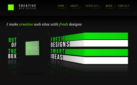
A web designer brings life to the wireframe by coming up with a visual representation of the website (see The Ultimate Web Design Workspace) .The mockup is meant to provide your web client with visuals of what the completed site will look like in a browser window before the web developer spends any time building the web pages.
A graphic mockup is the best way to show the client what the finished website will look like because it can demonstrate near-precise color, accurate representation of font sizes, and precise placement of all the navigation and content elements on the site relative to one another.
YOU MIGHT ALSO LIKE
