
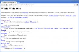
 Web design has come a long way since 1991 when the first ever website was published. Exclusively text-based, this first website marked the beginning of what would become a digital revolution. And while recollections of “under construction” GIFs and blinding background colors make me thankful for just how far web design has come, there are some historical web design choices that in fact demand a nod of approval.
Let's take a stroll down memory lane and look at how web design has evolved (for better and for worse) over the past two decades.
Antiquity
Prior to the late 90s, there was no such thing as "high-speed" when it came to internet connections. It was dial-up modems, or it was nothing. Therefore, websites from these early days needed to be built for less-than-stellar connection speeds. They were largely comprised of text, and what we now take for granted as "design layout" did not exist. While later versions of HTML allowed for more complex design capabilities, they were still extremely basic, consisting mainly of tags for headers, paragraphs, and links. Visual considerations such as typography, imagery, and navigation were still things of the not-too distant future.
21st Century Takeaways:
While the function of these early sites was purely informational, there are some design elements from these days of antiquity that still apply today. These first websites were very lightweight, optimized for that slow internet connection we all remember. These design considerations took user experience into account - something websites today don't always remember, even with our faster connection speeds.
Yes, today's internet can handle media-rich websites ... but it still has some limits. Large media files and heavy graphic design can contribute to high bounce rates when load speeds aren't as fast as we expect. Keep your user in mind when considering complicated design, and remember to K.I.S.S.
 The Middle Ages
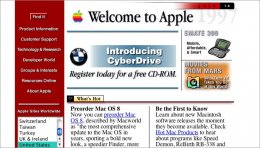
The middle ages of web design were plagued by on-site page builders and spacer GIFs (better than an actual plague though, eh?). By the mid-90s, web design had evolved both in terms of structure and appearance. Designers began to use table-based layouts to organize their content, allowing for greater flexibility and creativity. Sites were still quite text heavy, but this text could now be divided into columns, rows, and other navigational elements. Graphical design elements also quickly grew in popularity. Page hit counters, animated text, and dancing GIFs are just a few of the graphical elements that mark this period in web design.
Today, there are plenty of reasons why table-based design is not the best choice for your website - the extensive markup, slow page-load times, and visual inconsistency are just a few of the pitfalls of this method. Regardless, this development was an important one in the evolution of web design. It was the beginning of a concerted move toward page structure. Different elements could now be positioned in different sections of a web page, so designers had to consider the best way to present their information to the user.
Today, page structure remains important and becomes critical when thinking about such design elements as navigation, content, calls-to-action, and trust signals. The positioning of these elements will determine how a user experiences and interacts with your site. While these considerations might not have been at the forefront during the middle ages of web design, they are certainly important today.
 (P.S. If you want to learn more about usability, one of our partners, Callia Media, has an excellent ebook on the subject; specifically, how to align it with inbound marketing.)
The Renaissance
Renaissance. Rebirth. Web design has had its fair share of reimaginings, but one of the first occurred with the introduction of Flash. Developed in 1996, but made popular a couple of years later, Flash opened up a world of design possibilities that weren't possible with basic HTML. It was the marriage of virtual graphics and interaction.
While many of the same design elements of the previous period were still present, these were enhanced (and I use the term loosely) with new features such as color-changing navigations, tiled background images, neon colors, 3D buttons, and the ever-popular splash pages. It marked the beginning of visitor-focused design. Structure and navigation became important considerations and design began to zero in on appearance and usability.
Seeing as Flash has been deemed one of the biggest SEO sins of all time, we’ll take this era as an example of what not to do. While the increased use of multimedia content was intended to attract more visitors, it likely had the opposite effect. Some of the biggest misuses of Flash today come from incorrect scripting. Making this mistake across an entire site is extremely detrimental to SEO, so you might be better off just avoiding it. If you still feel compelled to utilize Flash, however, do so correctly. Even better, opt for alternative applications such as JavaScript or HTML5 to get similar effects.
The Enlightenment
The early 2000s brought with it an increase of support for CSS, which allowed for the separation of content and design. This gave greater creative freedom to both web designers and content developers - content could now be developed exclusively from design, and vice versa. This made websites easier to maintain (less code and complexity), more flexible (div tags are independent of one another), and quicker to load.
Better understandings of color also saw the increase of whitespace and the decrease of garish colors, like neons. Links began to be attached to icons rather than just text, resolution and pixilation became more important concerns, and considerations over the placement of content also grew. Overall, it was a period when usability started to become more important than other design elements.


YOU MIGHT ALSO LIKE
