
Media Queries
Responsive design uses a CSS3 feature called media queries. Media queries inspect the characteristics of the device and adjusts specific website styles accordingly. E.g. A media query may ask if the horizontal resolution of the device is equal to or less than 480px. If the answer is yes, the CSS may adjust the layout into a single column.
Here’s a few things we can do using media queries:
- discover if someone is holding their phone in portrait or landscape orientation
- hide or show certain content depending on what size device a person is using
- move and resize content for optimal viewing on a variety of device sizes
In essence responsive web design “responds” to our devices and adapts to create an enjoyable user experience. And this happens in real time as you turn your device or resize your browser window.
Break Points
When programming a responsive website, developers set ranges of media query values to target specific device classes (i.e. smartphone, tablet, desktop/laptop, high res desktop/laptop). Each range of values activates a unique set of CSS code to construct the web page to view optimally on the target device. A breakpoint is the transition between media query values.
Here’s a simple example: If the available browser width is at least 780px the website may display menu bar that spreads across the top of the page. However, if the available width is less than 780px the css may restructure the menu bar into two rows or move the links into a drop down menu. When you resize you browser window below 780px wide you’ll see the menu adjust. This transition is a breakpoint.
To see this in action, check out this site we created for the Capital Area Food Bank. As you resize your browser window you’ll see the menu, slider and other elements adjust as you reach these break points.
Currently there are no widely adopted best practices for defining break points. In my opinion break points should loosely reflect device classes and be led by the design of the website. The goal is to create a site that looks good on any device and sticking to predefined break points won’t always accomplish this.
The Fluid Grid
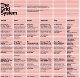
Designers have used grids for decades when designing layouts for print and this is true of good web designers as well. Traditionally we think of grids in terms of columns and rows with fixed widths, heights and gutter sizes. We may build a website using a 960px grid divided into 12 columns measuring 40px wide with 20px gutters. This works well for fixed width sites where the content is always the same width.
When we are designing a responsive website, we must think of column and gutter widths as a percentage of a maximum available width. This means the grid measurements expand and contract as needed, as does the content within them. See the difference between a fixed and fluid 960 grid on this site by selecting “Fluid 12-column” and then “Fixed 12-column” from the menu bar.
This Changes Everything
As web designers, we must change the way we think about web design. We’ve already learned that our print design skills are valuable, but not totally adequate, when it comes to web application. However, many of us design fixed width sites with a white knuckled hold on every graphic nuance. This is the control we were used to with print.
To create responsively designed websites we need to loosen our grip and accept the fact that we no longer have pixel perfect control over every element of the design that we’ve so painstakingly created. This doesn’t mean we compromise design quality. When we adjust our approach and thoughtfully consider how our designs will adapt across a wide variety of devices, responsive design means we can craft sites that look beautiful and function well no matter what devices our audience may prefer.
YOU MIGHT ALSO LIKE


