Even though I learned about designing for the web in what most would consider the modern era, I still learned (what I would consider) the old way of doing things. No, I’ve never made a table-based site, but I learned how to build a site without all of today’s CSS techniques. I remember slicing gradient images into repeatable, 1-pixel-wide background images, I remember how annoying it was to make a scalable container with rounded corners, and I remember adding classes of even and odd to list items and table rows.
I learned the ways of Photoshop, Illustrator, and other Creative Suite applications, but I had no set processes or preferences early on—I was bias-free, and nothing was sacred. There’s no arguing that the Creative Suite applications are powerful, feature-rich, and have the intangible value of being industry standards—the PSD format is almost as universal as PDF—but, they just didn’t feel like the right tool for the job, especially to someone who was new to it all.
As browsers became more advanced and rendering shifted from images to native CSS, the old, established applications fell out of step. A weird divide grew between how things were done in Photoshop and how they were implemented in code. The time was ripe for an application that was built, from the ground up, focused on the new era of interface design. And that’s when I found Sketch.
Navigating around Sketch is a breeze, and it doesn’t stop at the interface. Documents are broken down into pages, and pages are broken down into artboards. With an unlimited number of each, there’s a lot of flexibility to be had. There’s no right or wrong way to use pages and artboards, so bend them to fit your process.
I’ve created Sketch pages to match each site page, with artboards to show responsive states. I’ve created pattern library pages, with artboards for things like type styles, control elements, and other general styles. I’ve made pages for icon sets, with an artboard for each individual icon. I find navigating through pages and artboards is a lot easier than opening multiple files and dealing with somewhat strange naming conventions.
Back in the days of slicing designs, one size and format of each image would do just fine. But today, it’s not uncommon to have multiple sizes and formats of each image asset to support different viewport sizes and display pixel densities. Though we’re using images for less, exporting has become much more complex, tedious, and important.
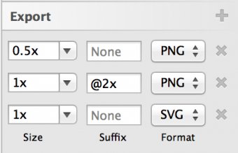
Sketch is built with a modern workflow in mind. Every single object and artboard in a document can be made exportable, and configured with multiple export rules. For each rule you can set a specific size, filename suffix, and image format.  My most frequently used export rules: high-PPI-ready and standard-sized PNGs, as well as SVGs for supporting browsers.
Exporting assets is generally time-intensive, and future updates require a complete re-export. Once export rules have been set up in Sketch, all assets (or a chosen subset of assets) can be exported, formatted, and renamed with one click.
There are a ton of workflow improvements to be discovered in Sketch—things like global text and layer styles, reusable elements, square and layout grids, iOS mirroring, and a powerful third-party plugin system (my favorite of which is this content generator plugin).
Sketch isn’t without its flaws and pain points. Being focused on interface design, there aren’t many fine-tuned controls for image editing or manipulation, which often has me jumping between Photoshop and Sketch. Brush tool fans: you’ll still be using Creative Suite for the time being, because Sketch has nothing to offer on that front. It’s not the best tool for things outside of interface design, and I’ve heard many people who do photorealistic or heavily-detailed icon work say that they still prefer Adobe’s offerings.
While this can be seen as a positive or a negative, the Sketch team is just four people. Small teams like that obviously can’t move as fast as a team like Adobe, but their support is top notch and personal. It’s still a young tool, so there are some funny bugs that pop up every now and then, but Sketch is maturing really well, and version 3 has been an incredibly solid release.
The prospect of changing design applications is intimidating, especially in fast-moving environments. It slowed me down at first, but ultimately led to a better, smoother design-to-development workflow. If you’ve got a small or internal project coming up, maybe take advantage of their free trial and see if it works for you.
Get our latest articles in your inbox. Sign up for email alerts.YOU MIGHT ALSO LIKE


